

Defining Modern Living
Naming, Strategy & Identity
for a Contemporary Home Label
MYLK partnered with Nomi Living to build the brand from the ground up. From naming and positioning
to verbal identity, visual systems and packaging,
we shaped a cohesive brand language rooted
in quiet refinement.
Background & Context
Nomi Living was conceived as more than a home décor label. It was envisioned as a design-led lifestyle brand for people who see their homes as extensions
of their identity. Spaces shaped by balance, calm
and thoughtful detail.
The founding company behind Nomi has long operated as an exporter of home products,
supplying global markets with craftsmanship and manufacturing expertise. With Nomi, they set out
to enter the Indian D2C space for the first time and build a brand of their own.
While many home brands compete through
decoration and seasonal trends, the ambition behind Nomi was different. The goal was to create a brand
that celebrates restraint, craftsmanship and
everyday elegance.
As the brand prepared to launch, the challenge was
not simply to name the brand or design a logo or packaging. It was to define a clear language for how Nomi should exist visually, verbally and across every product and touchpoint.
MYLK was brought in at the earliest stage to shape
that foundation.

Brand Strategy
MYLK began by studying how contemporary home brands shape the experience of living spaces.
What gives a home brand its sense of refinement
and longevity?
We found that the strongest brands do more than sell décor. They express a point of view on how people live with objects in their homes.
For Nomi, this meant defining a set of foundations
that guide how the brand should look, feel and evolve.
Brand Positioning
For those who value refined design and honest craftsmanship, NÖMI creates beautifully made pieces that elevate everyday living.
We design with intention, every thread, every curve, every color chosen to bring balance and quiet beauty to the spaces people inhabit.
NÖMI stands for the new language of living: one where grace and design meet durability and purpose.
NÖMI is derived from Naomi, meaning grace and pleasantness, then reimagined with a modern, European accent.
The umlaut over the O adds design clarity, precision, and rhythm. NÖMI reflects a duality the brand stands for: beauty with utility, refinement that feels effortless, and elegance that never tries too hard.
Behind The Name

Research & Insights

What Defines Nomi

For those who value refined design and honest craftsmanship, NÖMI creates beautifully made pieces that elevate everyday living.
A home is more than a place, it is a reflection of the people who live in it. It holds warmth, familiarity and comfort. NÖMI exists to elevate that space through thoughtful, timeless design.
Each product is created with intention, every thread, curve and colour chosen to bring balance and quiet beauty into the spaces people inhabit.
NÖMI represents a new language of living: where
grace and design meet durability and purpose.
Core Idea
.jpg)

Less, Done Well
Minimal design that feels
intentional, not empty.
Comfort First
Objects meant to be used
every day, not just admired.
Materials That Age Well
Natural textures and
tones that grow richer over time.
Quiet Luxury
Elegance that doesn’t need
to announce itself.
Timeless Choices
Design meant
to last longer than trends.
Warm Minimalism
Clean spaces
that still feel lived in.
NÖMI exists to bring thoughtful, enduring design
into everyday living. The brand believes that the objects we surround ourselves with shape how we experience our homes.
By combining refined aesthetics with honest craftsmanship, NÖMI creates pieces that elevate everyday spaces without overwhelming them.
Each product is designed to feel considered,
balanced and lasting objects that quietly
enhance the way people live.
Rather than decorating for its own sake, NÖMI focuses on timeless design and materials that age well.
The goal is not simply to fill a home with products,
but to contribute meaningfully to spaces that feel warm, personal and lived in.
Purpose
Verbal & Visual Identity
Logo Grid
.jpg)
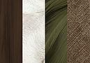
Colour Palette

Collaterals
The entire palette is low-contrast and tonal, which is the hallmark of sophisticated minimalism. It avoids harsh brightness or primary colors, instead relying on rich, earthy pigments to communicate quality, refinement, and tranquility.
Mascot Design


.jpg)


Working on a new brand or rebrand?
Share your details and a short brief - we’ll get back to you soon.
